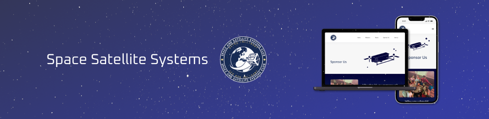
Space Satellite Systems
Executing a product refresh to increase engagement
Role
Product designer
Duration
October 2025 - March 2026
Tools
Figma
Skills
UI product design
Brand identity
UX research
The problem
Space Satellite Systems, a UC Davis space-engineering club with roughly 970 members, communicates primarily through Discord and social media. However, they reported that event attendance was stagnant. The club’s outdated website, with a broken calendar and dead links, weakened student engagement and appeared inactive to sponsors. The club partnered with #include, a student web development agency, to rebuild the site to recruit members, grow the Discord community, and reach sponsors.
My role
As the product designer, I worked on two high-traffic web pages: “Join Us” and “Sponsor Us.” I worked directly with the design team to ship them to the engineering team, translating design into a developer-ready component library.
Defining the project
Project Overview
Client: Space and Satellite Systems (SSS) is an undergraduate-led organisation at UC Davis that provides students with hands-on space technology engineering experiences. SSS provides an inclusive environment where students can make meaningful contributions to projects and learn industry skills.
"How Might We" Statement: How might we design the SSS website to be more welcoming for both students and sponsors while improving access to the most important information?
Our Goals


Research
Competitive Analysis
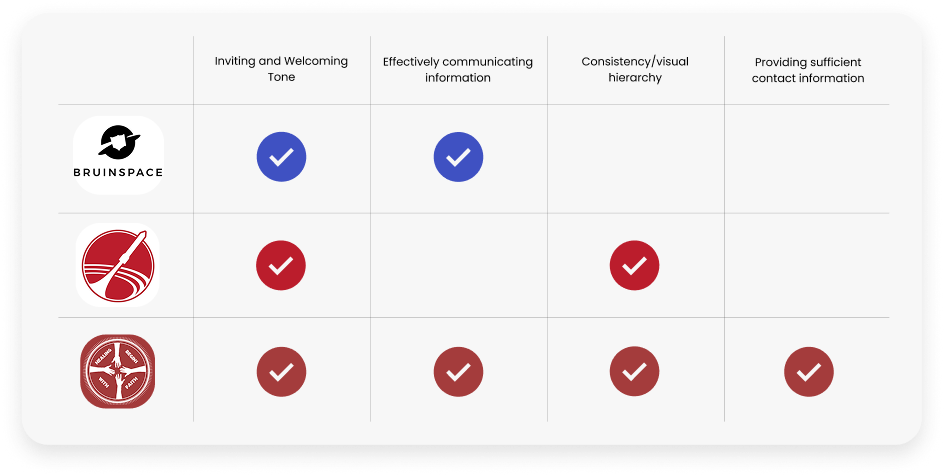
We compared similar websites with SSS' goal and highlighted and discovered features that were effective and ineffective.
User Personas
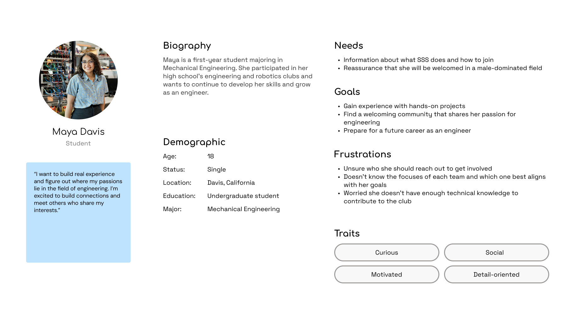
We created user personas to guide our design process and understand the primary users of the club’s website: students and sponsors.
User Flows
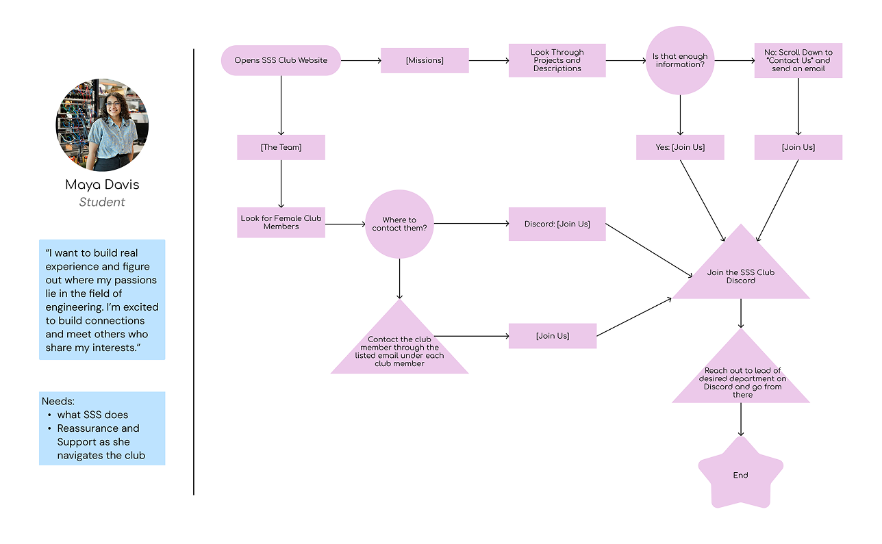
With the target audience defined, we mapped user flows in order to discover how they would navigate the site.
Step 3: Ideate
Low Fidelity
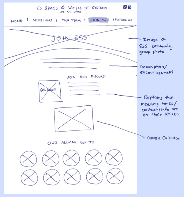
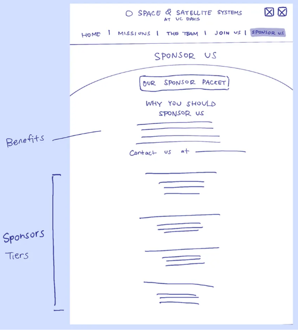
I sketched the interface for the "Join Us" and "Sponsor Us" pages.
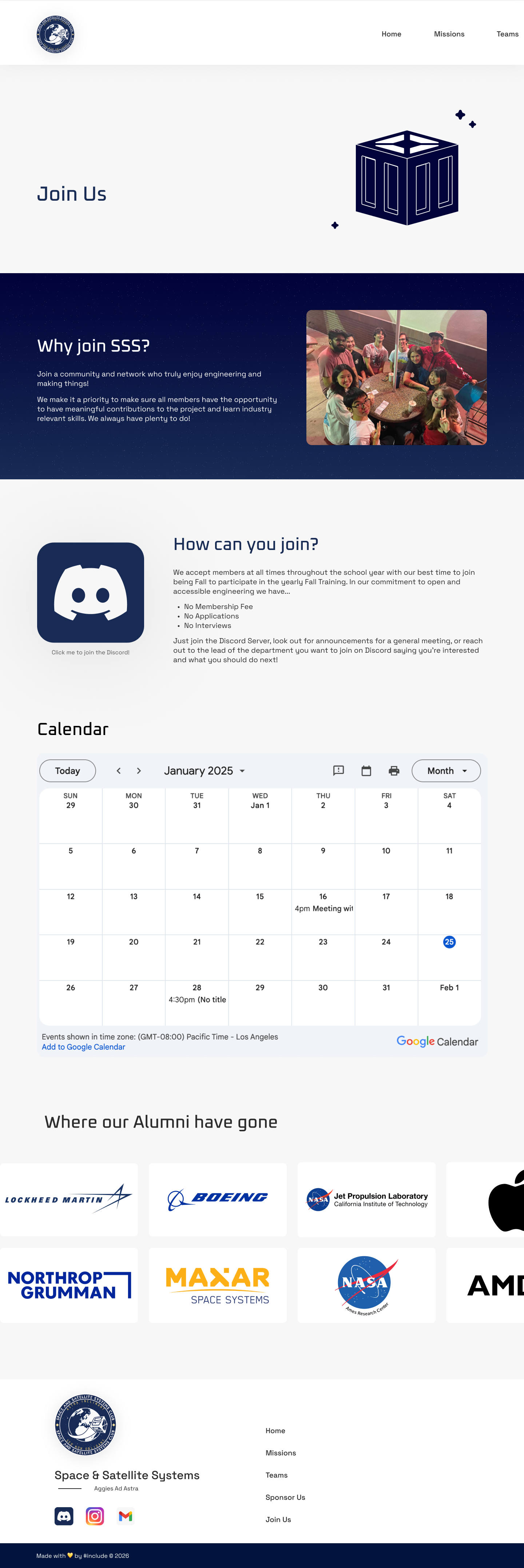
The "Join Us" page establishes a welcoming environment to appeal to students pursuing engineering. The page will include a community photo, contact information, a Google calendar, and employers that hired alumni.
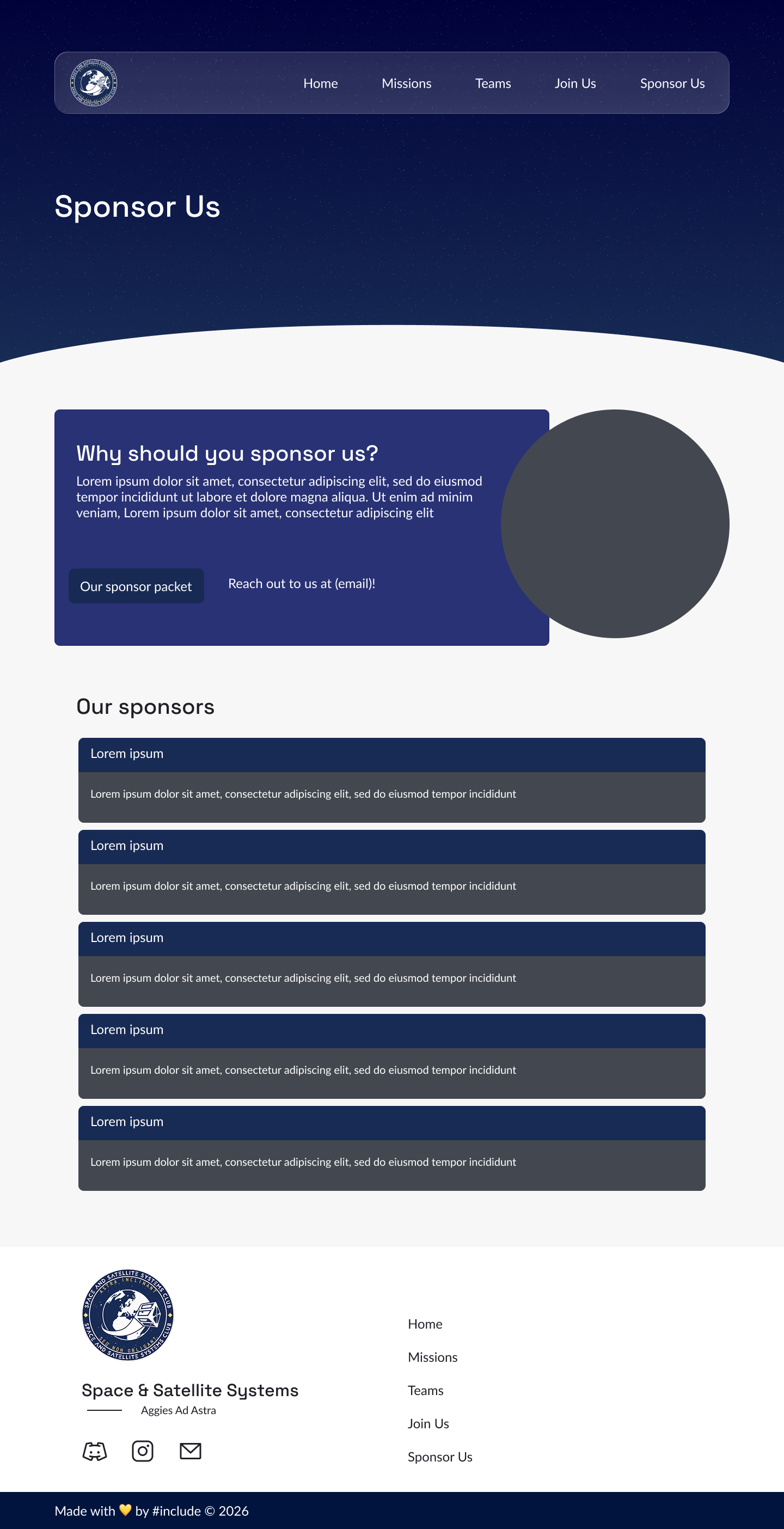
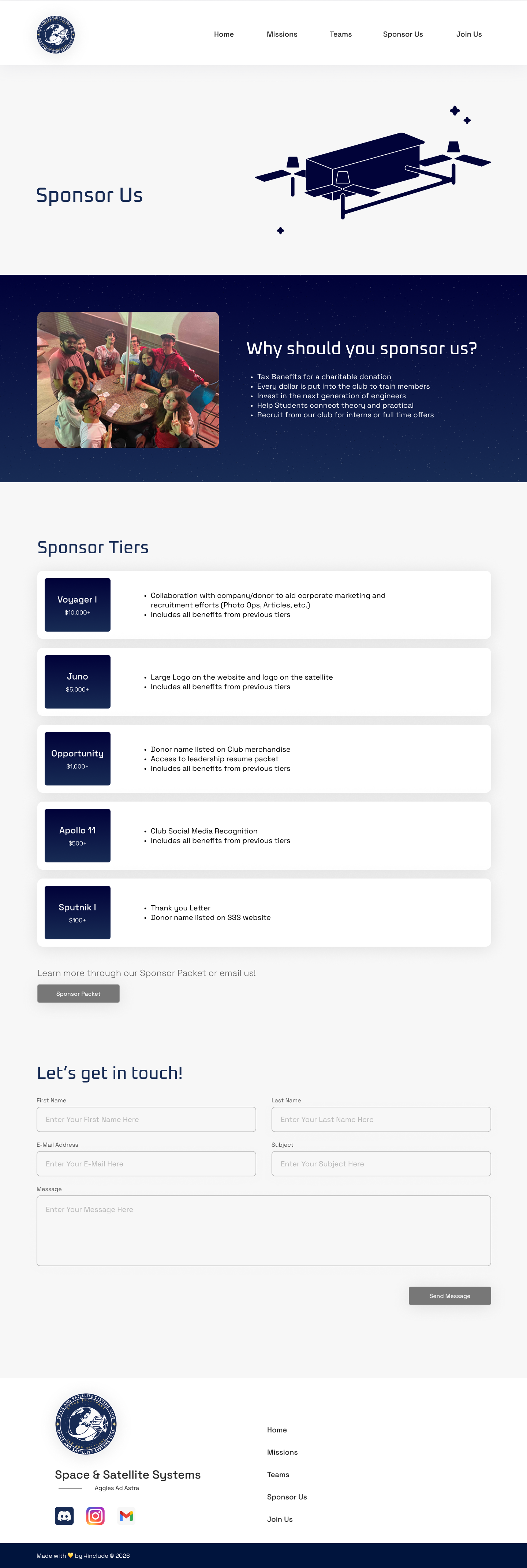
The "Sponsor Us" page encourages tech industries to endorse their organisation. The page will include a link to their sponsor packet, a description explaining how sponsorship goes towards supporting students in the organisation, and a list of sponsors who have endorsed the club.
Mid-Fidelity
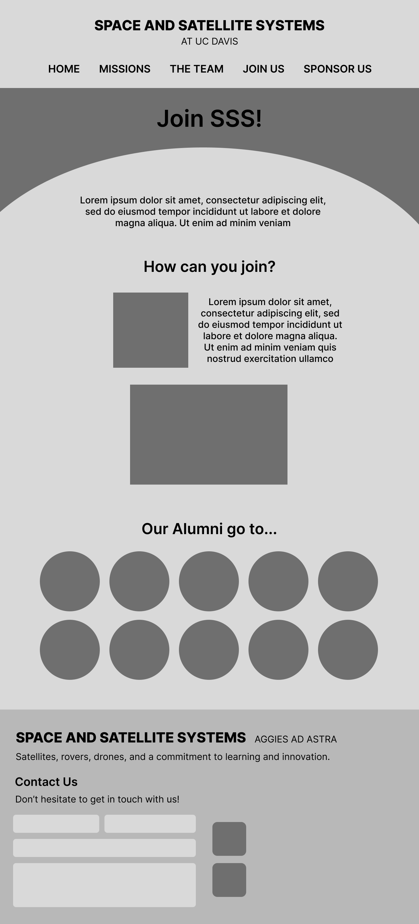
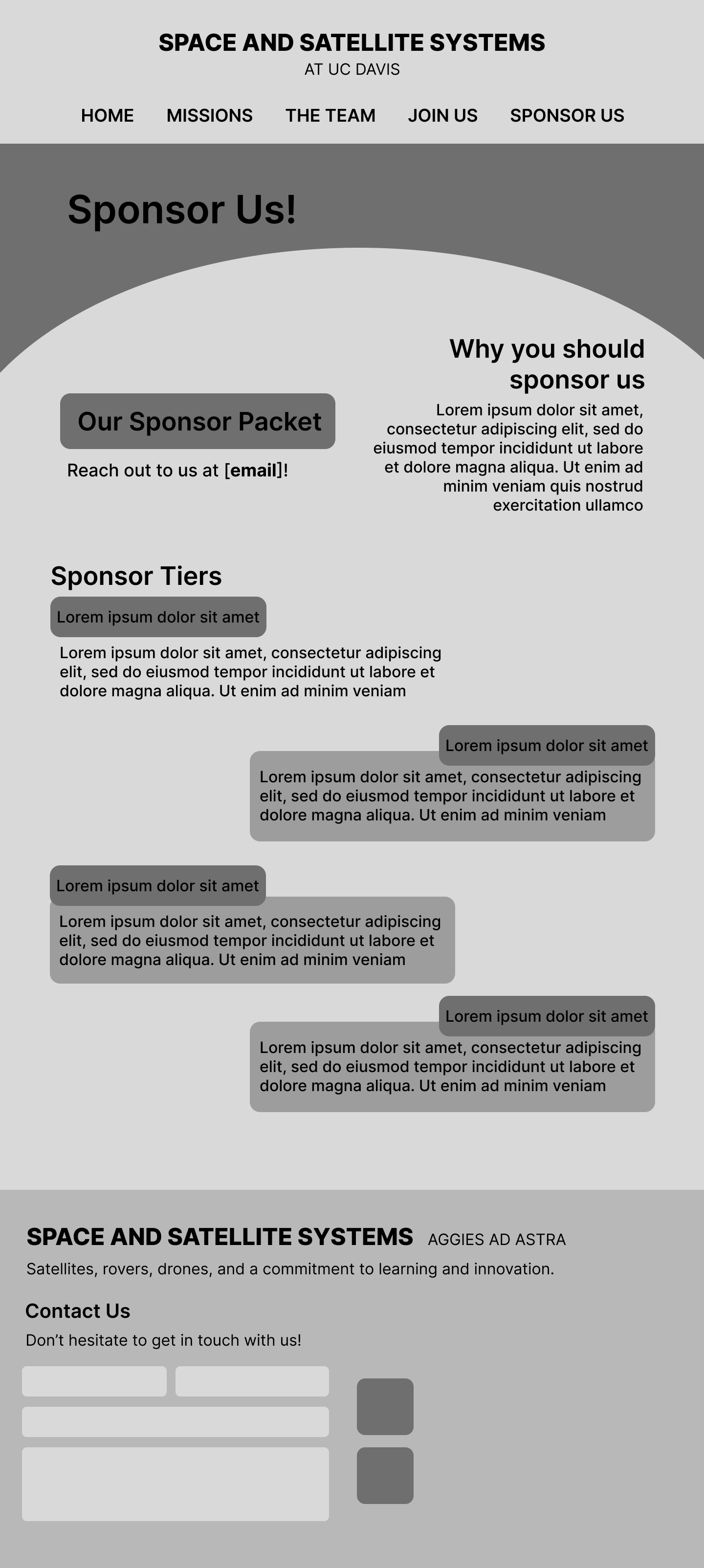
Following my sketches, I designed monochrome wireframes with placeholder text.
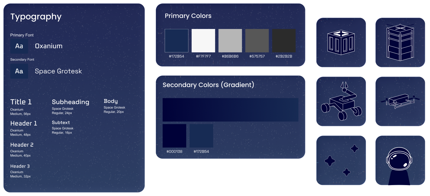
We created a design system that embodies space and tech.
I refined the monochrome wireframes through:
- Applying the design system
- Standardizing layout components
- Highlighting significant information in text boxes
High Fidelity
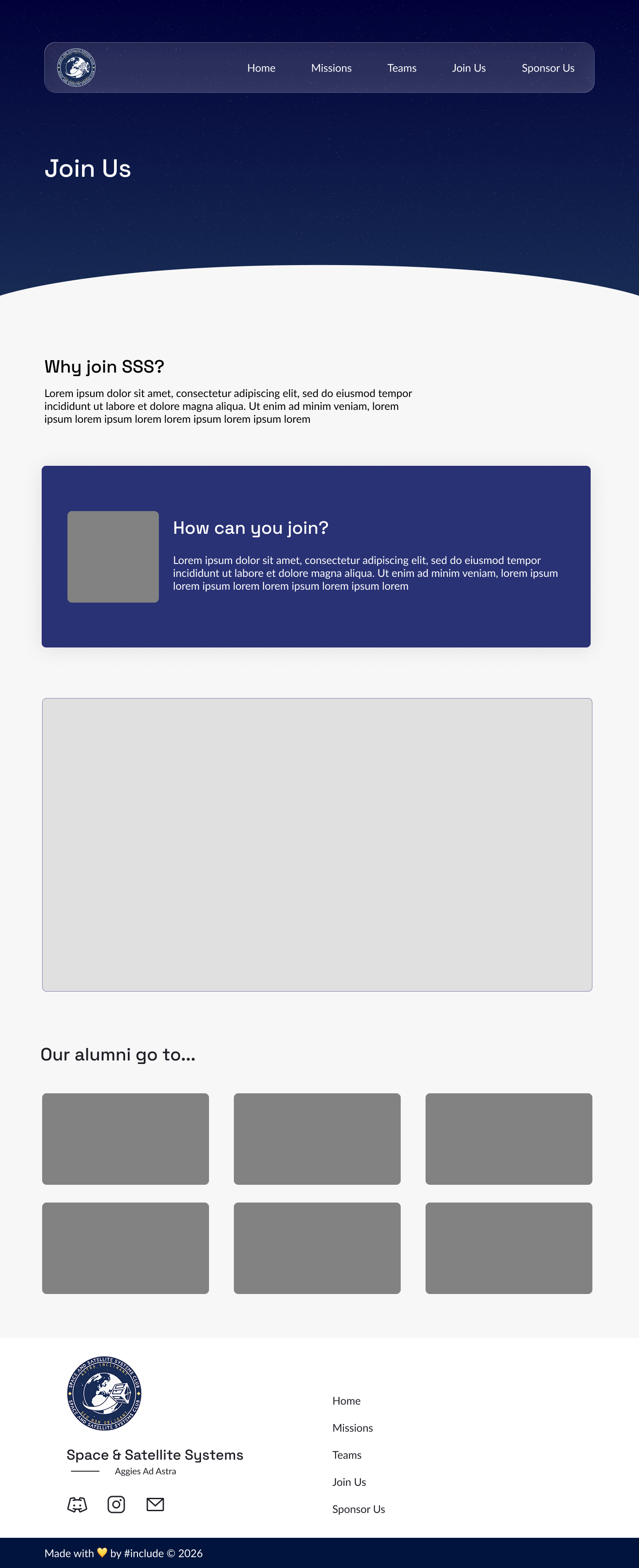
In the high-fidelity stage, upon recieiving feedback from the client, I shipped the final product by:
Building credibility: Added an animated carousel displaying established tech industries demonstrating alumni success.
Improving contact access: Integrated a contact form to increase outreach.
Enhancing contrast and readability: Replaced dark tones with white tones to improve overall visibility and visual hierarchy.